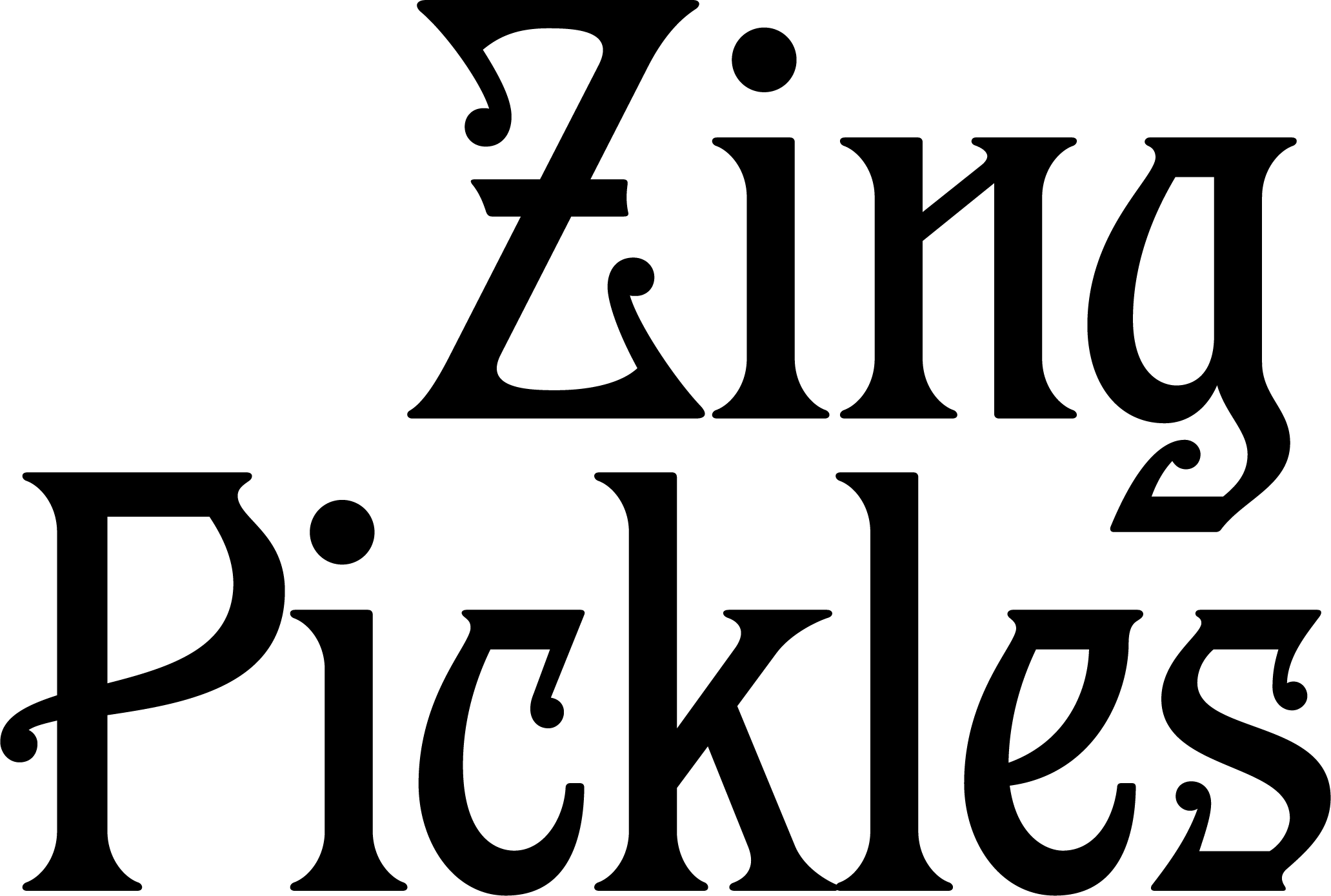
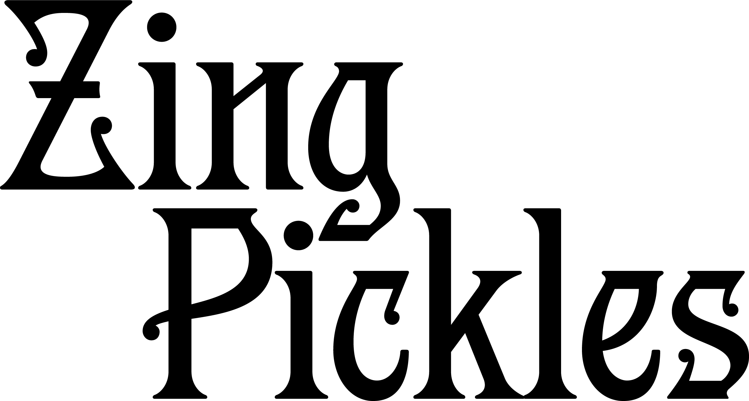
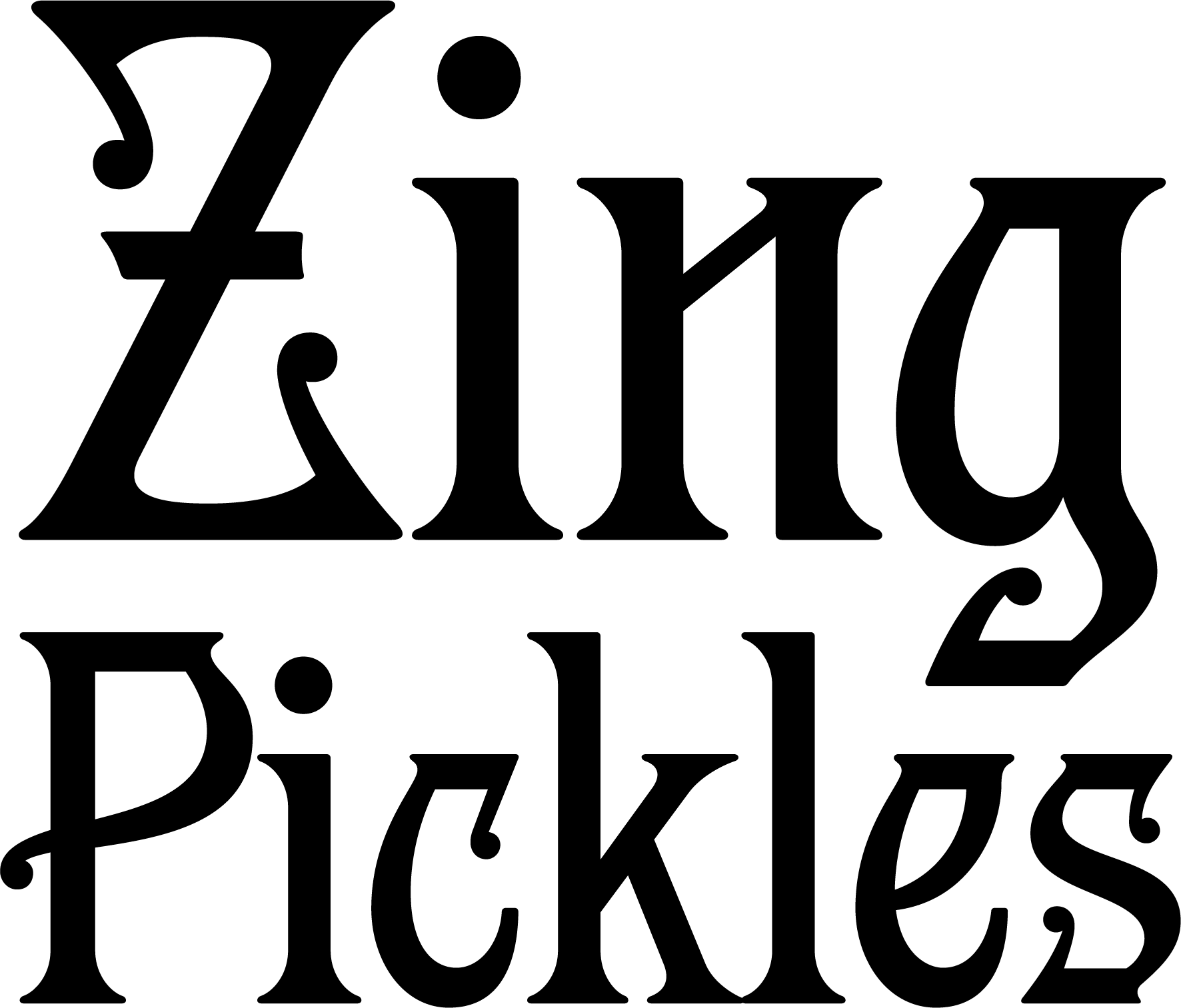
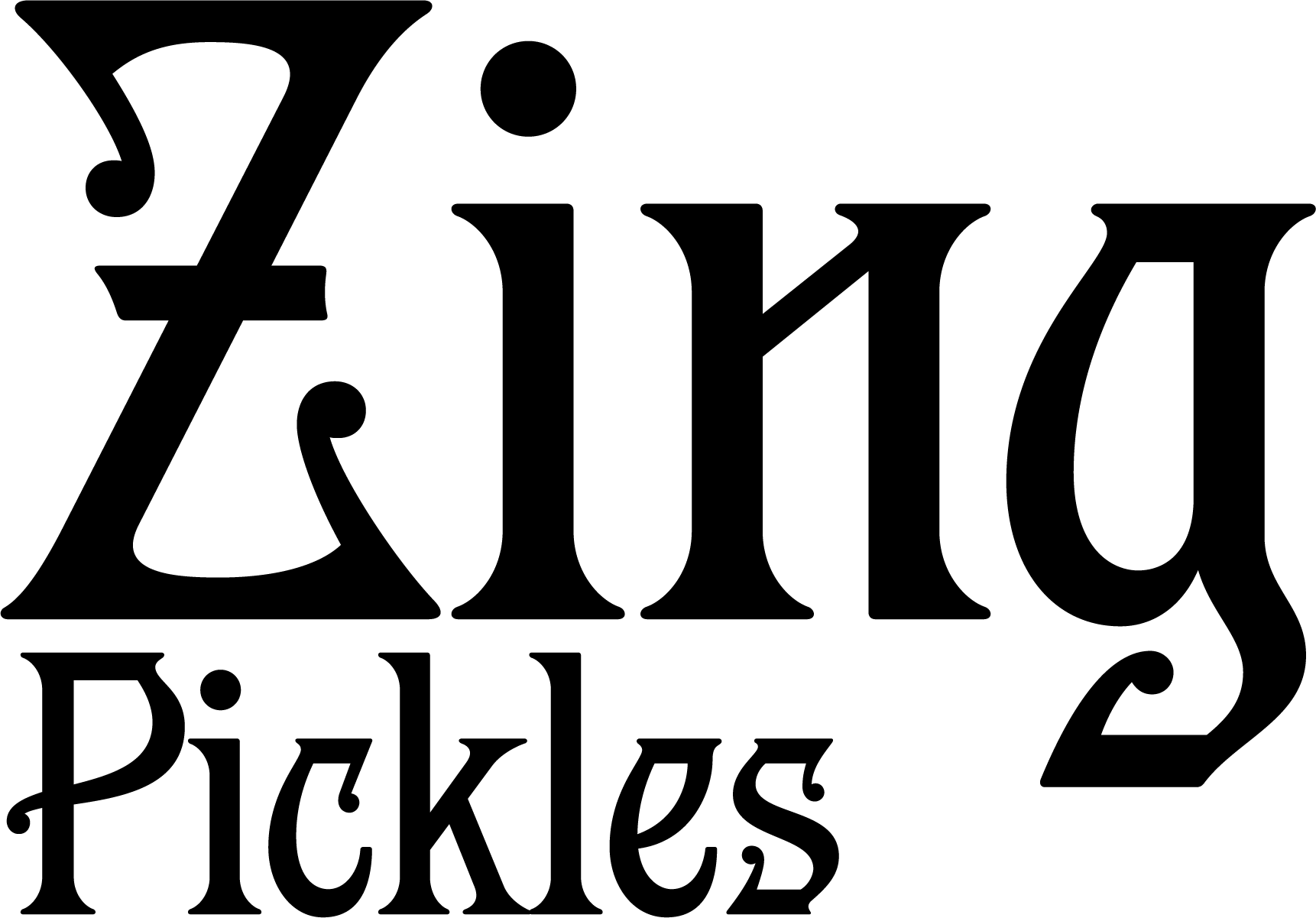
Zing Pickles
@designerbriefs weekly challenge.
The mission
Create a brand identity and packaging design for a pickle company named Zing. Zing is bold, tangy and flavourful, the perfect choice for food lovers craving a little extra zest in their lives.
Brief by Designer Breifs. @designerbriefs on Instagram.
The solution
At Zing we believe good pickles are the key to any tasty meal or snack. Our pickles are perfect for adding a tangy punch to your food and unlock that little extra zest in your life. Zing’s style takes inspiration from the artwork of Ancient Mesopotamia, the very origin of pickles themselves, combining tangy flavours with historical heritage. So, whatever the occasion, Zing pickles will always bring the flavour.


The insight
I wanted to approach this brief from a unique angle to distinguish my design, while working within the brief parameters. To do this, I researched where pickles first originated, Ancient Mesopotamia, and inspired my design choices off the cultural art.